
Create More. Chase Less.
The platform that launches your creativity forward.
This is the living brand story. Pick a chapter, or fall through them in sequence.
Built for the work.
Not the transaction.
LaunchPad is a creative marketplace connecting clients with photographers, videographers, and editors. Not a gig platform. Not a hiring board. A place where creative work is treated like what it is — craft worth respecting.
Our signature feature, LaunchDeck, lets a client book up to five creatives under one project. One brief. One vision. This is what "collaborative" looks like when it is built into the product, not bolted on.
Mood · Collaboration. Confidence. Captivating.
Stage · Bootstrapped · closed beta · building toward Rhode Island
We got out
of the way.
The tools that exist today ask creatives to commoditize themselves. We asked a different question.
Five values.
One rule.
The palette is strictly grayscale — so the work of the creatives is the only color. Scroll right through it. →
“In this monochromatic symphony, the vibrancy of our users' work sings the loudest.”
Two voices.
One conversation.
“Modernism with nostalgic undertones.” Heavy weights carry hierarchy. Shown in Archivo — the on-spec free stand-in.
Calm, humanist, considered. Shown in Newsreader — the on-spec free stand-in.
The display font is never set in all caps — Title case or sentence case only. The company name is always LaunchPad, never LAUNCHPAD.

Liftoff.
Two ascending lines rising from a launchpad. Not a lettermark. Not "LP."
The launchpad
The platform, the foundation, the community that makes the work possible.
The liftoff
Two lines rising together — directional, committed to the same trajectory. Creative momentum.
What's ahead
Limitless potential and satisfaction — the thing you are pointed toward.
Three lockups.
One mark.
Three official lockups cover every legitimate context. Need a fourth arrangement? Rethink the placement.
Clear space · Give the mark room equal to the height of its launchpad base on every side. Nothing touches it.
Always
- Keep it grayscale — white on dark, dark on light.
- Scale it freely; the proportions hold.
- Give it contrast and room to breathe.
Never
- Recolor it. Adding color breaks the system.
- Stretch or distort it. Scaling yes, warping no.
- Add shadows, glows, or effects. The mark needs no help.
- Place it on low-contrast backgrounds where it can't be read.
The grammar behind
the first impression.
The recurring moves that make a surface unmistakably LaunchPad — before a logo ever appears.
Every section marked. Designed with intention, numbered and placed.
Filled square leading a thin rule. A breath, not a break.
Heavy type leads. Everything else supports. That's the contract.
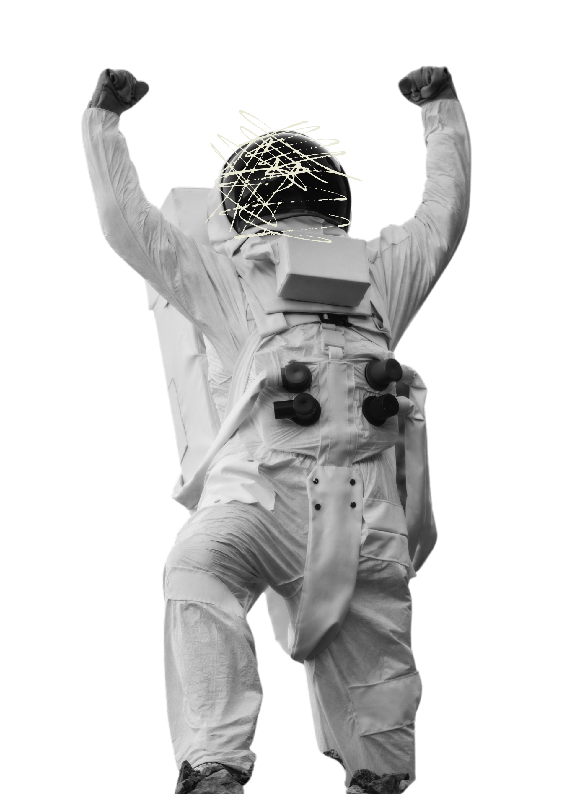
Atlas
Our astronaut. He turns up where the brand reaches upward.
The starfield
Faint stars, slowly blinking — coded live into our web backgrounds.
Black & white only
Real creatives at work — studios, shoots, edit bays. No stock, no AI people.
The logo pattern
The mark tiled at low opacity — the glyph as quiet texture across a dark surface.
The topographic pattern
The contour field behind our hero — cartographic depth, drawn in grayscale.
Sound like
a creative peer.
Not a platform. The person in the room who has done the work, respects the craft, and speaks plainly because they don't need to impress you.
User-Centric
Built around the people doing the work. Open LaunchPad and feel it was made for you — because it was.
Collaborative
A network, not a solo-gig board. We say "your team," not "your hire."
Reliable
We ship what we say. Trustworthiness isn't a marketing attribute — it's the job.
Resourceful
The community, tools, and connections are genuinely useful. We name that plainly.
Inspirational
We remove friction and get out of the way. Great work needs room, not a pep talk.
“The platform that launches your creativity forward.”
“Built for creators, designed for organizations.”
“Made for creators, by creators.”
“Create More. Chase Less.”
- Hype-bro language — no “let's gooo.”
- Exclamation stacking.
- Generic empowerment — no “unlock your potential.”
- MBA jargon — no synergy, no leverage.
- Emoji, unless explicitly approved.
- “Vendors,” “talent,” “freelancers” — we say creatives.
- All-caps display type — the name is always “LaunchPad.”
If a piece of writing could come from any SaaS company, it isn't ours.
LaunchDeck
Book a whole team in a single project — up to five creatives. One brief. One place to coordinate. One booking to manage.
Not a convenience feature. The product philosophy made concrete: creative work is collaborative, and the platform is built to match.
Built on · React Native / Expo · Supabase
Rhode Island.
Then the map.
Prove the model in a tight market. Build the community right. Expand with something that works — not something that merely scales.
Create More. Chase Less.
The problem we're solving, stated as the answer. Creative time belongs to the craft — not the chase.